
This article was originally featured on the The Bubblin Blog. It has since been updated and migrated over to the Toucaan blog because it is relevant here.
One of the capabilities of Toucaan is prioritizing and delivering the most intrinsically suitable stylesheet for a smartwatch. Toucaan uses a css router to accomplish this.
Let's look at what it takes to design a website (or web app) for the tiniest viewport on the web—the Apple Watch.
The Watch & The Browser
If measured in device resolution, the Apple Watch is similar to a mobile phone. A petite Apple Watch (the fifth generation and upwards) resolves to about 324 x 394 pixels. About as much as the first-generation iPhone.
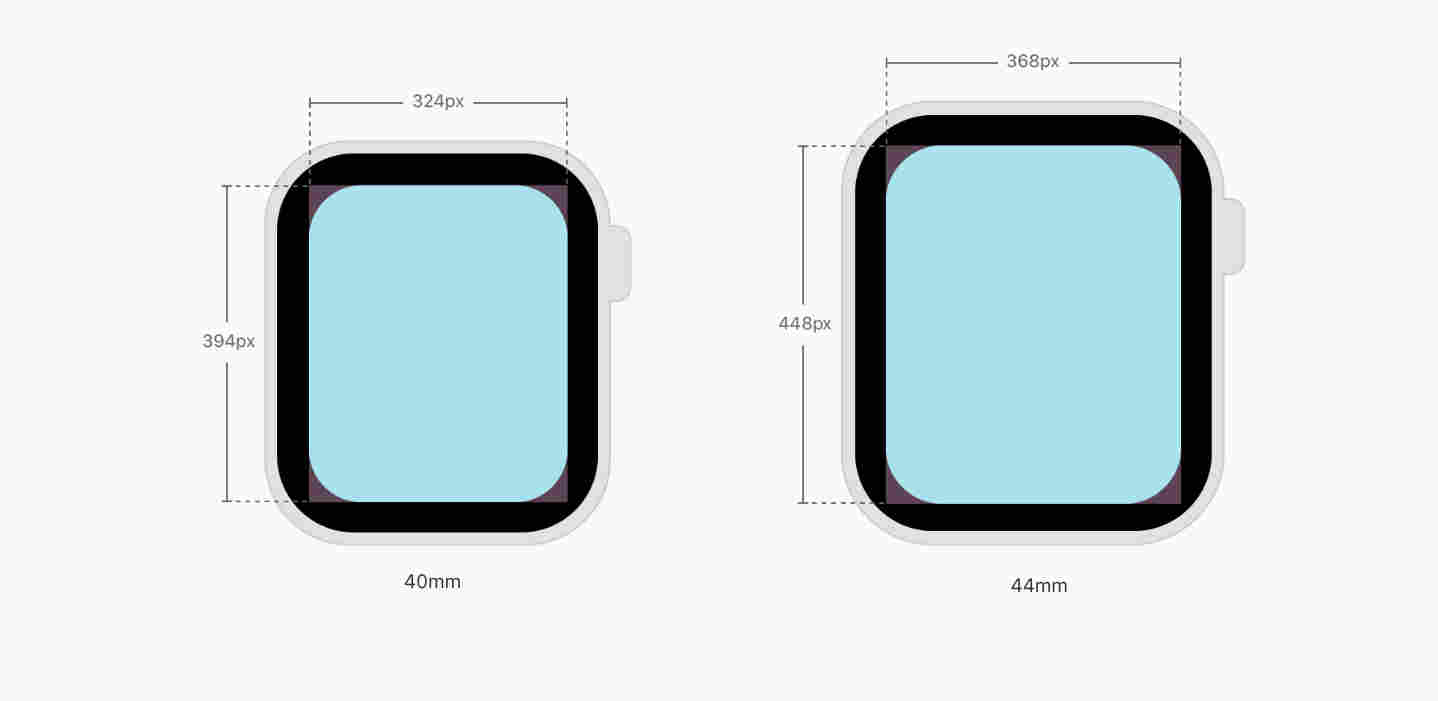
However, the physical size of the watch is only 40mm—approximately 1.57 inches along the diagonal. Not only is the physical size of the wristwatch small, the time spent glancing through its screen is usually shorter too. Meaning we're dealing with both small physical size and short attention span.
Secondly, the viewable or the "light up" area on the watch is only about 1.18" x 1.25". It is also slightly obscured by the rounded bezel around the viewport, depending on the viewing angle and distance from the viewer's eye.
Mobile first Smartwatch first.
There are many important things to consider before designing websites for a watch. Chances are that your existing web app or website is responsively designed and is already compatible with the smartwatch. By default, Apple scales down every website to render it in the best possible way.
WatchOS will scale down content by a factor of 0.49 to ensure every responsively designed page fits the tiny form factor without introducing the horizontal scroll. This default behavior guarantees the existing mobile website to "work" on the watch browser correctly with no extra configuration required from the end user.
However, even mobile UI is usually too complex for the smartwatch. It is better to reduce and optimize your application for the watch separately. Deliver an experience that belongs to the smartwatch instead.
Below are a few tips & potential issues to bear in mind while designing for the Apple Watch.
Practice Extreme Minimalism
The first thing to internalize about an Apple Watch is to admit that showing nothing is better than something. Practice extreme minimalism while designing for smartwatch users.
More generally:
- Display only the most relevant information to the user for which they will raise their hand for a few seconds.
- If the content is text-heavy, left align the content and HTML elements.
- Group the UX visually at the center of the screen to help users take action quickly.
- Use the entire width and height available of the viewport.
- Design for no more than two outcomes wherever possible.
- Use native elements of the browser. For example, avoid building a javascript component for a hamburger menu with twenty different options. You might want to keep javascript to a minimum as well.
- Use
aria-labelsto helpwatchOSpick up the correct interface for the end user. The Apple Watch supports several form elements, including thenumbertype (type= "tel"), thedatetype (type=" date"), and theselectinput (<select>) type. - Unless necessary, avoid comprehensive form submissions via the smartwatch.
- There is no support for the service-worker api. Meaning no PWA or offline first.
- No inline video playback. There is no support for videos on the Apple Watch at this time.
- For images, use a single autoscaling asset with 100% width. Multiple versions of the same image will require sustained HTTP connection and additional disk space. It is, therefore, not recommended.
<img src="single)resource_url" width="100%" style="max-width:100%;" />
- The Apple Watch displays in portrait mode only. It may allow displaying in landscape orientation in the future, but Toucaan already accounts for such a future scenario with its intrinsic css router.
- The
webkitbrowser on the watch displays contents in fullscreen mode as much as possible. The browser UI (URL bar) is usually hidden away on the top. - Using pixels or pixel-based css units like
emorremis not ideal. For example, width-based MQ breakpoints in pixels will fail to distinguish between a mobile and a watch. - Practice minimalism to the extreme. Design with only one or two UI elements per page, or your users will experience the "fat finger" inaccessibility.
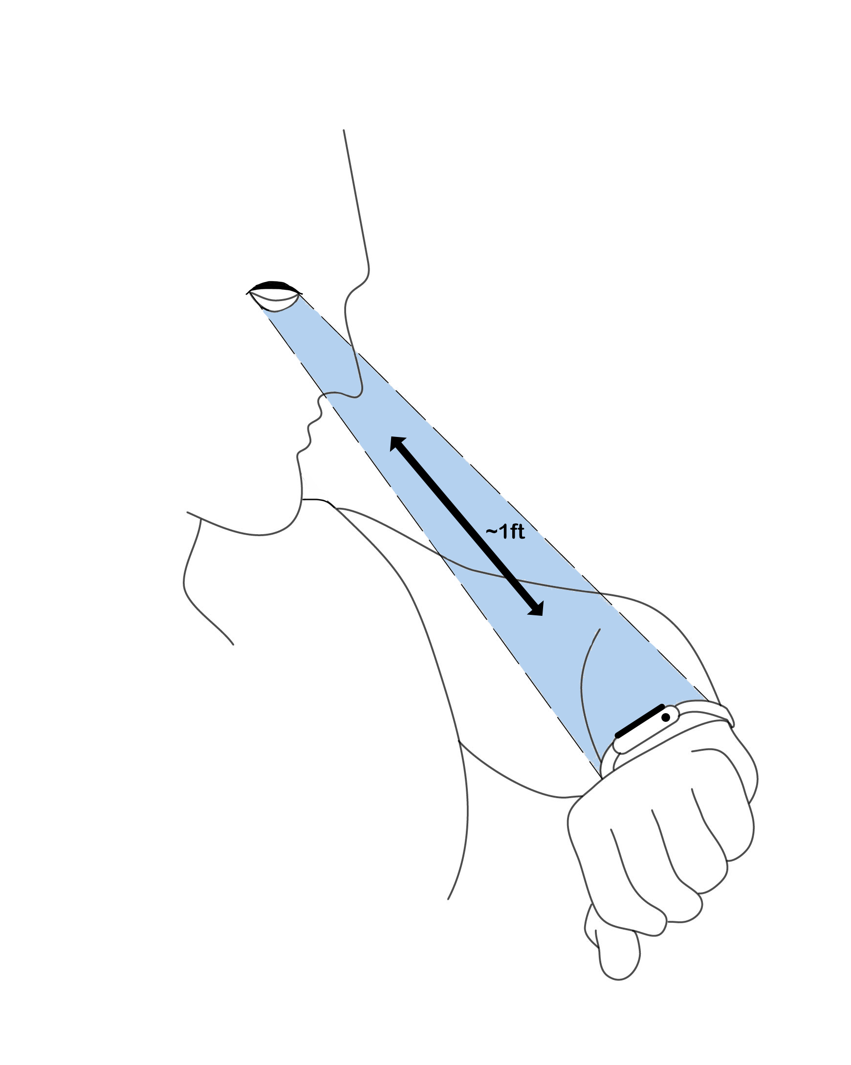
- Optimize for both short viewing distance and short attention span. The viewing distance on an Apple Watch is approximately 7 to 12 inches from the viewer's eye. In comparison, a smartphone is viewed at about one and a half feet distance on average.
- Use
--vminbased typography with a large base font size that allows a maximum of 30 characters per line. - Always enable pinch-zoom on the watch if your page is text-heavy, even with the decently sized typeface.
- Avoid using web fonts (Example: Google Fonts) or any hosted typography. Toucaan recommends using the system fonts on the Apple Watch, but this could change as the watch ecosystem matures.
Coincidentally, Apple recommends using the relative size and dynamic type to ensure contents fit (expand or contract naturally) the viewport properly. It is excellent because Toucaan uses intrinsic typography as the default across all mediums.
The WatchOS Meta Tag
To take control of how your website will appear on the Apple Watch, add the following meta tag on the head of your webpage:
<meta name="disabled-adaptations" content="watch">
WebKit will now know it doesn't need to scale down your webpage and will render according to your instructions.
As expected, the form controls on the watch will pop you into fullscreen mode for each input. Labeling your form elements correctly and attaching the appropriate ARIA roles to the fields is essential.
Designing for the Apple Watch is easy. There is only one rule to abide by:
Adopt extreme minimalism in every situation.
Now that you understand the watch browser better, you can also design for it.
Credit: Super thankful to the incredible Somya Garg for designing the artwork on the viewing distance from the watch.