
This article was originally featured on the The Bubblin Blog.
2023 is almost here.
While the world continues to race towards space age or AI (LLM) driven publishing, let's turn our gaze towards the other more pressing frontier of technology that is relevant to our lives:
CSS. 🙂
Let's look at how we could use the newest powers of css to layout and style our modern web applications. In this post, we will start from the basics of a webpage, i.e., HTML & CSS, and develop a new, more strategic, intelligent, fresh, and maintainable approach to writing css (and framework).
This new framework will be created from scratch and will not follow the aging principles of responsive design. I have named our new css framework Toucaan, and you can join me on the journey of building it together. The complete code of this project is available on its official repositories on GitHub, along with a noddy Toucan logo that I designed using css.

Toucaan–The Tropical css Framework.
Qualitatively speaking, Toucaan intends to weed out all the unwanted css that a framework no longer needs. It is a deep dive into the available css standards of the day to discover new and valuable patterns according to the landscape of new web today.
Who knows, we might even identify a few industry-wide anti-patterns in the process, and we can address those with a few suggestions as we go about building Toucaan ground up.
The latest official handbook containing some of the more profound ideas and experiments that went into building Toucaan is out!
Why call it Toucaan?
Well, quite simply because I owned the pretty domain name.
Cliché"
Besides, Toucan is a beautiful bird. This aggressive little arboreal ramphastidae symbolizes both beauty and strength. We will base our css framework on this highly social and resilient bird to implement a styling stricture that will cover all the wilderness of devices on the web.
Occasionally—though rarely—we may even spar with other css frameworks using our "colorful, mean and oversized" bill. Therefore—say hello to Toucaan—the tropical css framework for the web.
👉 CSS is hard. But if Toucaan, then you can too.
Existing Frameworks and Design Philosophy
With Toucaan, we will revisit every industry-wide design principle in existence today. We will test our ideas out in the open. No trick or technique, whether old or new, is off the table, but we will undoubtedly avoid using hacks. There are a few other rules that Toucaan will adhere to, which are described here.
Now there are a lot of well-established css frameworks out there like Bootstrap, Bulma, Foundation, Tailwind, and a bunch of strategies like the BEM, OOCSS, or SMACSS (and others) to organize our application code, but we will not try to imitate or wrestle with any of those.
We will instead start Toucaan on a blank slate so that we do not take away most of what these tools have to offer, but we also end up with something more than exists.
Let's begin.
The New Landscape of The Web
Before we write our first line of code, let us look at the variety of devices that are a part of the web today. There are many subtle differences between each, starting from device capability to aspect ratio, from browser support to potential accessibility situations, and of course, there is a constant flux of change in css standard itself.
It is essential to understand what the new landscape of the web looks like today and prepare for what we are up against with the new framework. Here are some of the devices that sport a modern web browser:


There is the Apple Watch with a webkit browser, and the iPhones are available in numerous sizes instead of just the one model that Apple used to promote earlier. There are iPads in multiple sizes, with an independent OS, a slew of Android phones and tablets of different form factors, and desktops, laptops, and touchscreen tablet PCs.
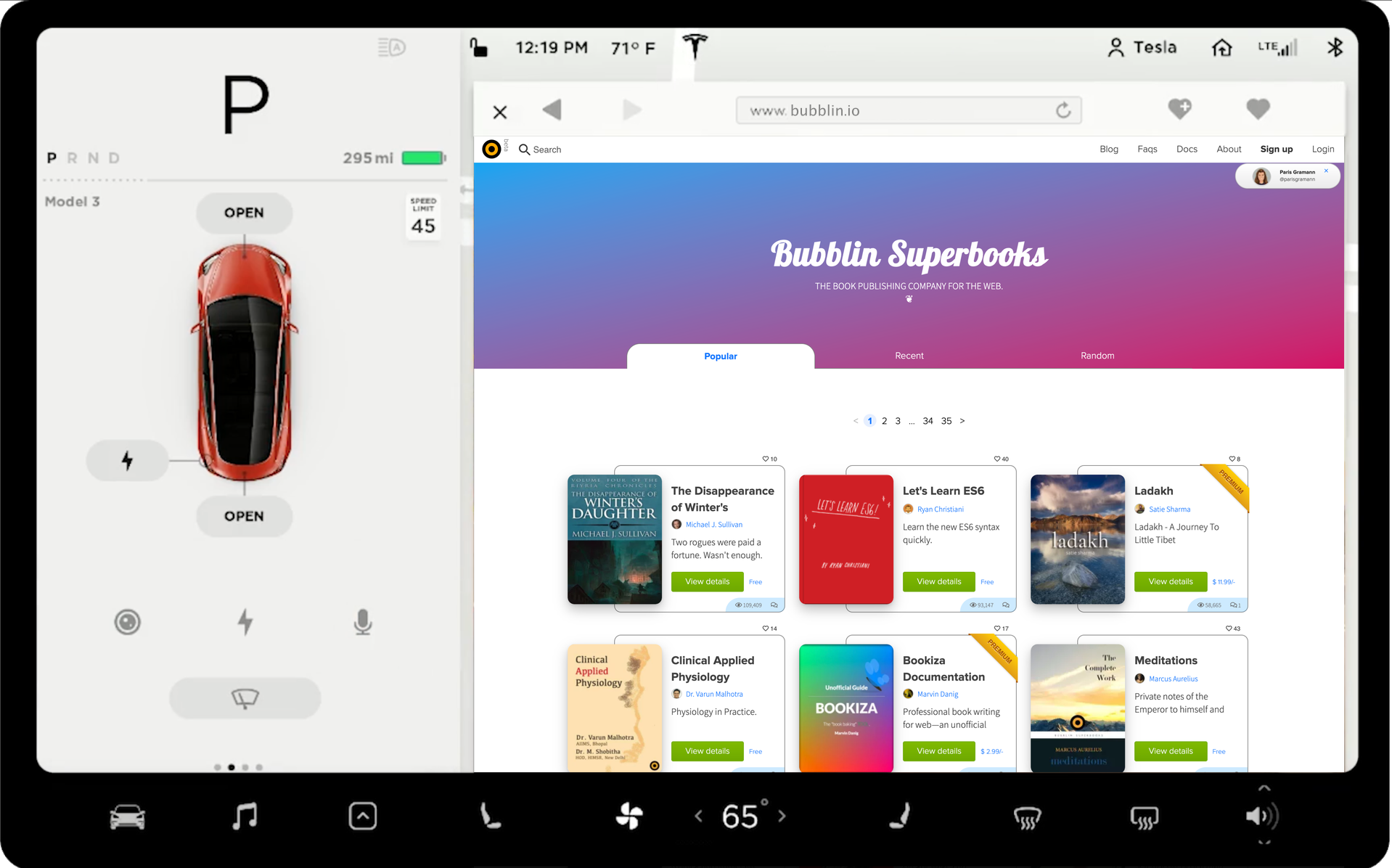
Several EVs, like the Tesla Model 3, also sport a web browser under a touch screen. There are intelligent televisions like the LG OLED TV series with a solid stock Chromium-based web browser. Samsung came out with a foldable phone recently, and Microsoft outed a foldable Surface tablet, and we could go on and on like this forever. It is never-ending!
One shouldn't forget about the low-powered devices on the budget end of the market as well. Phones like the Nokia 2.2 on Android (with A53 core) or similar are top-rated in their segment.
Given the diversity of devices and the scale of connectivity today, it is safe to assume that the range of devices available today is on a linear continuum of screen size and form factor; that the slate of glass or the touch screen is practically resizable freely just like the browser itself.
The First Issue
The web is enormous now, and it is undoubtedly much harder to scale apps between the lowest and the highest options available today. Notice that we are not even talking about vendor inconsistencies at this point.
The range of hardware itself is vast enough to void the very first assumption taken by nearly all the major frameworks:
Hardcoded breakpoints using device width..
Voila, and now we have our first anti-pattern to go after! ( ͡° ͜ʖ ͡°)
MQs with hardcoded width breakpoints.
Breakpoints are hardcoded on Tailwind css like this [1, 2], for example.
// tailwind.config.js
module.exports = {
  theme: {
    screens: {
      'sm': '640px', // Translates to hardcoded break-points in media queries.
      'md': '768px',
      'lg': '1024px',
      'xl': '1280px',
    }
  }
}
On Bulma, like so [1]:
/* Bulma: */

@media screen and (max-width: 768px) { /* Some style classes & rules here. */ }

@media screen and (min-width: 769px), print { /* Same class names but different value-props here. */ }

@media screen and (max-width: 1023px) { /* Repeat the class names but with slightly larger value-props… */ }

@media screen and (min-width: 1024px) { /* Again repeat the class names but with even larger value-props…  */ }

@media screen and (min-width: 1216px) { /* Dang!, again.*/ }

@media screen and (min-width: 1408px) { /* Meh. */ }
And so on. As you can see, these MQ breakpoints are hard-coded values of screen width along which we split and silo the application's css. But there is a problem with this approach. Screen width varies greatly, from an Apple Watch, with sub-inch screen width, to a desktop or even a large television monitor with a width measured in feet. And then, for each silo, we repeat the css classes with only slightly different property values to manually tie the page together.
Even typography and spacing need scaling according to the silo in play.
Example off of Tailwind:
+mobile
  +typography-size('mobile')

+tablet
  +typography-size('tablet')

+touch
  +typography-size('touch')

+desktop
  +typography-size('desktop')

+widescreen
  +typography-size('widescreen')

+fullhd
  +typography-size('fullhd')
Every existing css framework follows this pattern. A new breakpoint is added to the framework every time the manufacturer rolls out a new device segment. The question is: How many breakpoints will cover everything on the web today? And at what point will there be all too many?
The web before the iPhone was desktop-only. It was a simple time then. With the rise of smartphones, we got the mobile web, and in the process, we walked into this tunnel vision of using width-based breakpoints. But what now?
Width-based MQ approach worked great initially, with context switching between desktop and mobile only, but now with so many types of devices and form factors to serve on, boy, do we need a new strategy.
While it would be nice to continue doing what we have been doing for years, deep inside, we all agree that hardcoded MQs based on screen width are anti-patterns.
Toucaan will try to do away with these first. But is there a better way?
The next chapter discusses that with Orientation Querying.
Credits:
Super thankful to Sonica Arora, Abigail Rennmeyer, Varun Singh, and Nilesh Trivedi for reviewing this post for clarity.