This article was originally featured on the The Bubblin Blog. It has since been updated and migrated to the Toucaan blog because it is relevant here.
Raise your hands if you love the notched iPhones and Google Pixel. 🙋♀️🙋♂️
Okay. Not many hands went up there, but I am sure, as a web developer or designer, you wouldn't you like some extra real estate for your app? A beautiful edge-to-edge "bezel less" display—well, almost—makes the notch not appear as a quirk for most users.
At least to me, the notch hasn't been an issue so far. I mean in portrait orientation.
As long as I am surfing the web in portrait mode, most websites look okay and work great, and the notched bezel doesn't appear on my list of nits to fret about.
It is the landscape mode, however, where the notch pokes me in the eye.
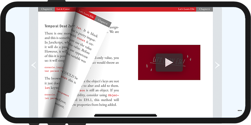
Take a look at The Dev Blog site, for example:
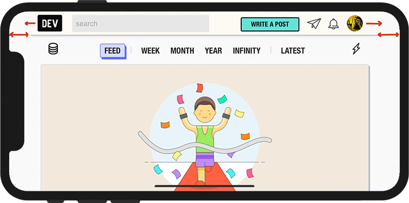
You will immediately notice that the header ends abruptly on both ends in a broken floating way. My designer's soul feels this is a bug in the layout.
However, what's worse is that the layout breaks even when the width of the header element is specified 100%. Yes, this is one of those weird instances of implementation where things don't work as expected by the end-user or follow the spec. Does setting 100% width on the screen no longer mean 100% of the screen anymore?
Is 100% width restricted to a "safe area"?
While I rarely read The Dev Blog with my phone in landscape orientation, the situation is worse for YouTube. A thick red header broken at the edges looks horrible. And most of the time, I view videos on my phone in landscape orientation.
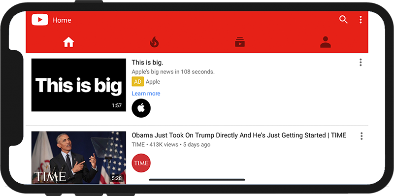
This bug bothers me more on YouTube because videos are generally best viewed in fullscreen and landscape mode. And every time a video ends, this glaring header bug in blood red color shows itself at the top of the page. I wouldn't blame YouTube for missing out on this issue because they did set the width to 100% on their css. It's the implementation of iOS Safari that doesn't meet the specs on the notched phones.
A Solution
TBF, Apple adds an extra blank gutter area on both sides of the webpage to avoid content getting obscured by the notch. The area between the gutters is called the safe area as mentioned earlier in the post.
Given that Apple has forced this change despite its failing spec and the general assumptions about how widths work in css, now the question is how to handle the notch correctly for your website. And can we do it without hacks or tricks like testing for the safe area margin?
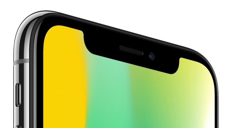
The latest iPhones come with an island instead of a notch. I don't particularly like having a hard black blot floating around my apps or websites, but this is Apple and Apple's design language lately. As small voiceless developers, we can only adapt our designs around the notch or away from the island and continue to give it our best shot.
The meta tag for the notched phones isn't enough anymore. Apple now recommends using a @supports(padding:max(0px)) { env() } query detection to fix the notched environment for your website on iOS Safari (iPhones). I hate them for doing this, but this is the only way to tackle the notch on the newest iPhones.
Also, the notch cannot be fiddled with on the iOS Google Chrome browser or the iOS Firefox browser at the time of this update.
Google has announced that Pixel 3 and 4 will carry a notch like the new iPhones. The following blog post explains a simple technique to handle the notch in landscape mode gracefully. No javascript or css hacks are required for this technique to work, so shine away, you crazy diamond!
Enter Viewport-Fit Meta Tag!
A simple fix to use all the extra space around the notch is to set the new viewport-fit property like so:
<meta name='viewport' content='initial-scale=1, viewport-fit=cover'>
The meta tag above will do the trick and restore the relationship between 100% element width and 100% screen width as per specification.
@supports(padding:max(0px)) {
    body, header, footer {
        padding-left: min(0vmin, env(safe-area-inset-left));
        padding-right: min(0vmin, env(safe-area-inset-right));
    }
}
This query will allow your layout to access the areas behind the notch. Next, to ensure your content doesn't go under the notch either, you can use a container class like so:
.content {
  padding: 20px;
  padding-left: env(safe-area-inset-left); /* Apply safe area */
  padding-right: env(safe-area-inset-right);
}

/*** There are four safe-area padding options:
*
*   padding: env(safe-area-inset-top)
*           env(safe-area-inset-right)
*           env(safe-area-inset-bottom)
*           env(safe-area-inset-left);
****/
There are four options to handle viewing on all four sides of the phone.
By resetting all four safe-area paddings, one can guarantee a safe area for content no matter how the user holds their phone to view content.
A Better Solution
The safe-area padding insets resolve the issue at hand for the most part. Still, I recommend not using these unique non-standard properties (or hacks if you allow me) explicitly created for the non-rectangular viewport. It is both excess and unmaintainable.
There's a much simpler solution to avoid the content clash with the notch using simple and standards-compliant css properties. We'll use ordinary width definitions per single responsive @media-query, like so:
/* scss snippet */
@media only screen and (orientation: portrait) {
    body {
        .shrink {
            width: 95%;
        }
    }
}
@media only screen and (orientation: landscape) {
    body {
        .shrink {
            width: 90%;      /* Shrink slightly to avoid the notch. */
        }
    }
}
.center {
    text-align: center;
    margin: 0 auto;
}
That's it. You don't have to use env(safe-area-insets) to arrive at the desired layout and happily maintain just one code for all mobile phones, regardless of whether they are notched. In your HTML, apply the css class .shrink on the <main> container element to make it work across all devices and all viewports for your users. Just one rule to rule it all!
<header>
    <!--Sticky header with 100% width running across the notched screen -->
<header>
<main class=" shrink center">
    <!-- Body here -->
</main>
<footer>
    <!-- Full-screen width under the notch -->
</footer>
I prefer this approach because it helps avoid using non-standard properties (safe-area-insets) for a goal achievable with just standard css. On Toucaan, we've adopted this approach as the default.
Several other solutions are floating around the web using JavaScript, but I do not recommend those. CSS is best suited for solving this layout nit.