
This article was originally featured on the The Bubblin Blog.
In a previous chapter, we started with a blank file to test the responsiveness of an empty page. That worked well, and it was easy enough to implement.
Touch a new file on the disk and open it on a browser like Chrome:
$ touch example0.html // Create a new blank file.
$ chrome example0.html // Open this 0-byte file on your favorite browser.
Inspect this 0-byte blank page from your browser's console (press ⌘+⌥+I). You'll notice a few HTML elements in there, even though the page we loaded into the browser was empty.
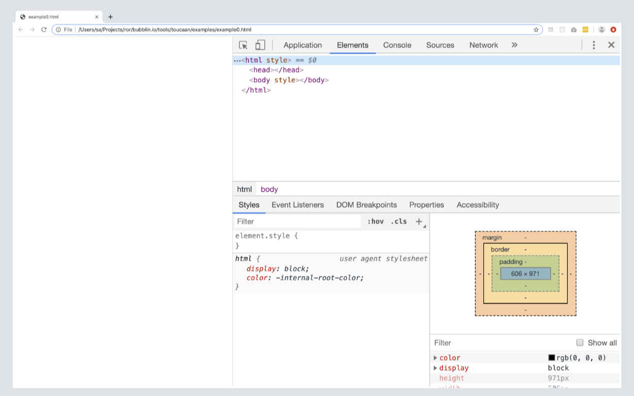
Every web browser renders these elements to display a blank webpage correctly. Browsers usually try and "fix" the html on the page because it is in its nature to do so, and they do this quietly.
<!-- Blank page rendered on desktop Chrome, Firefox, Brave, or Safari. -->
<html>
  <head></head>
  <body></body>
</html>
In the 'Styles' section (see the screenshot) of your browser's console, notice how the browser also uses a default user-agent 1 stylesheet called the html.css. This file contains the default rules each browser ships with at the source and comes installed with every browser on your machine.
Until a few years ago, it was this html.css file that was the cause of much pain to the front-end community. Cross-browser inconsistencies were the bane of front-end design since each vendor had their own set of defaults that looked or behaved much differently from others.
Thankfully, those days are behind us, and the latest html.css on all modern web browsers is almost as good as a reset itself.
One can argue that html.css—the unset cascade—is practically consistent across the board, and no further reset is required for modern day web-apps.
Modern web browsers have evolved to a point where a heavy-handed reset or a broad normalization is no longer required.
In this chapter, we have implemented a fundamentally different type of reset by uncovering only the bare minimum ruleset necessary for cross-browser consistency. The new baseline is suitable for all the devices according to the new landscape of the web.
A light new reset was suggested for blogs by Andy Bell. While this reset is limited in scope for a blog, it establishes that little arm-twisting is required over the browser's initial defaults to develop vendor consistency.
This is excellent news and one of the main reasons we will keep Toucaan's reset a loosely coupled baseline for modern apps of late.
Coming back to the DOM with an empty webpage again, given that there are only three HTML elements required for a webpage to render correctly–to be valid–we will start with baselining Toucaan for only three essential HTML elements that a webpage requires, namely:
<html>tag or the :root element,<body>tag, and the…<head>tag.
Since the <head> tag is always set to display: none; there are only two tags, the <body> tag, and the <html> tag, for us to worry about.
Shown below is how we'll structure our new baseline:
<style>
    /* Combining baseline with the css router we created in an earlier chapter. */
    @import url('toucaan/portrait/portrait.css') only screen and (orientation: portrait);

    @import url('toucaan/landscape/landscape.css') only screen and (orientation: landscape);

    @media only screen and (orientation: portrait) {
        :root {
            /* Portrait variables go here.  */
        }
    }

    @media only screen and (orientation: landscape) {
        :root {
            /* Landscape variables go here. */
        }
    }

    /* Minimum HTML elements required for a valid webpage. */
    html {
      /* Some rules here. */
    }

    body {
      /* Some more rules here. Done. */
    }
</style>
This is it! All of it. This is what our baseline css or reboot would look like.
Everything else, every other HTML tag that your application would use, will require a reset specified elsewhere in the framework (discussed later). Those tags won't be a part of the distribution.
All things considered, a reset's size would depend on the nature of each app. A video hosting site like Youtube will need to reset the video tag, for example, whereas a blog app would reset tags like article, p, and heading tags, and so on.
This is a strategic position that we're flexible about. What are your thoughts on the inclusion/exclusion of other HTML tags on the baseline? Before you jump to answer this question, have you considered designing mobile apps with app-like design language and how that would affect the baseline?
The Trends
I suspect there wouldn't be many rules to import, even in the most complicated web applications out there. Our framework provides a place to include watered-down classless reset with the fewest defaults to fulfill any situation. I believe that this will help with both technical debt and the maintainability of the application.
In recent years, I have seen several new smarter resets pop up over the Internet, and each of them, even if not a complete solution, is a red herring to what is on the horizon: We need to discard using the generic normalization techniques and move towards a lighter system that covers the full scope of the new web.
The Full Baseline
Below is baseline.css on the Toucaan submodule for your feisty eyes:
/* Minimal baseline.css with critical css.    */
<style>
    @charset "UTF-8";   /* Recommended reading: https://www.w3.org/International/questions/qa-css-charset.en */

    /* Option 1. Use system fonts */

    /* Option 2. Use 'privacy safe' self-hosted typefaces with subsetting, or use…  */
    @font-face {
        font-family: "Font Family";
        src: url(data:font/opentype;base64, _font_subsetted_string_);
        font-style: normal;
        font-weight: 300;
    }

    /* Option 3. Hosted typefaces such as from Google Fonts. */
    @import url(https://fonts.googleapis.com/css?family=Font+Family:300,300i&display=swap);

    @import url('toucaan/portrait/portrait.css') only screen and (orientation: portrait);

    @import url('toucaan/landscape/landscape.css') only screen and (orientation: landscape);

    @media only screen and (orientation: portrait) {
        :root {
            --vmin: calc(100vw/100); /* Tentative */
        }
    }

    @media only screen and (orientation: landscape) {
        :root {
            --vmin: calc(100vh/100);  /* Tentative */
        }
    }

    :root {
      --vmin:1vmin;

      /*Font familia */
      --sans-serif: -apple-system, BlinkMacSystemFont, "Segoe UI", Roboto, "Helvetica Neue", Arial, "Noto Sans", sans-serif, "Apple Color Emoji", "Segoe UI Emoji", "Segoe UI Symbol", "Noto Color Emoji";
      --system: -apple-system, BlinkMacSystemFont, Segoe UI, Roboto, Oxygen, Ubuntu, Cantarell, Droid Sans, Helvetica Neue, Fira Sans, sans-serif !important;
      --monospace: SFMono-Regular, Menlo, Monaco, Consolas, "Liberation Mono", "Courier New", monospace;
    }

    /* Sane defaults below */s
    *, *:after, *:before   {
        box-sizing: border-box;
        /* Using margin & padding to position elements instead of flexbox is somewhat of an anti-pattern. We'll discuss this in a new post. */
        margin: 0;
        padding: 0;
    }

    html {
        background-color: white; /* Always set the background color */
        -moz-osx-font-smoothing: grayscale;
        -webkit-font-smoothing: antialiased;
        overflow-x: hidden;
        overflow-y: scroll;
        text-size-adjust: 100%;
    }

    body {

        /* Move this into font-family. */
        font-size: calc(4 * var(--vmin)); /* We'll deal with vmin-based typography through a separate post. */
        font-family: 'Font Family', var(--system);  /* 'Font Family', -apple-system, BlinkMacSystemFont, Segoe UI, Roboto, Oxygen, Ubuntu, Cantarell, Droid Sans, Helvetica Neue, Fira Sans, sans-serif !important; */

        font-smooth: always;
        font-weight: 300;
        font-style: normal;
        font-synthesis: none;
        font-stretch: ultra-condensed;
        font-variant: no-common-ligatures proportional-nums slashed-zero;
        font-kerning: normal;
        text-rendering: geometricPrecision; /* The complaints about geometricPrecision are more than a decade old. Should we revisit this? */
        font-display: swap;
        font-display: optional;

        -webkit-tap-highlight-color: rgba(0, 0, 0, 0);
        -webkit-backface-visibility: hidden;

        line-height: calc(1.5 * 4 * var(--vmin));  /* Or 1.5 */

        /* Colors + contrast (This will go into the color palette.) */
        color: rgba(0, 0, 0, 0.95);
        background-color: white;

        /* Dimensions */
        border: none;
        min-height: 100vh;

        /* Behavior */
        overflow: auto;
        -webkit-overflow-scrolling: touch;
        scroll-behavior: smooth;
        touch-action: auto;
    }

    /* Accessibility-specific media queries go below. */
    /* 1. Dark mode (or light), depending on the developer's priority. */
    @media screen and (prefers-color-scheme: dark) {
        body {
            background-color: #343434;
            color: #fff;
        }
    }

    /* 2. Override animations for users with motion sickness or other vestibular disorders. */
    @media (prefers-reduced-motion: reduce) {
        * {
            animation-duration: 0.01ms !important;
            animation-iteration-count: 1 !important;
            transition-duration: 0.01ms !important;
            scroll-behavior: auto !important;
        }
    }

    /* 3. Acquired notched space and made sure that iOS Safari uses only the available vertical height (100dvh). */
    @supports(padding:max(0px)) {
      body, header, footer {
        padding-left: min(0vmin, env(safe-area-inset-left));
        padding-right: min(0vmin, env(safe-area-inset-right));
      }
      body {
        min-height: -webkit-fill-available;
      }

</style>
Welcome to an intrinsically scaling baseline reset. These ideas have been rolled into the Toucaan Submodule with the most updated code.
Are you happy? Toucaan is. Toco, Toco!
Written by: Marvin Danig, CEO & Cofounder of Bubblin Superbooks and Red Goose. Super thankful to Sonica Arora, Satyendra Sharma, and Abigail Rennemeyer for all the editing help and time they could pass on from their busy lives.
To see what the latest html.css looks like on major browsers today:
-
Webkit html.css @Chrome & @Safari.
-
Quantum html.css@ Firefox.
-
Chromium html.css@ Blink or Edge browser
Footnotes
-
"html.css" ↩