
This article was originally featured on the The Bubblin Blog.
In the last chapter we floated the idea of replacing the first anti-pattern that pervades nearly all of the traditional css frameworks.
Here's a quick recap:
Hardcoded width-based MQ breakpoints that separate styles between desktop, mobile, and other category of devices is an anti-pattern.
Imagine a cascading order of MQs that doesn't use hardcoded values as breakpoints at all. Imagine a clear isolation of your design scope that allows you to go deep into the experience you're designing for.
Sounds fun? Great! Let's start with a blank page.
The Blank Page
Let's start with a blank page on your machine and load that blank page into your favorite browser (desktop).
$ touch example0.html     // Create a new blank HTML file.

$ chrome example0.html    // Open this 0-byte file in your browser.
Now resize the browser window a couple of times, and see what happens. It is just a blank page surrounded by the browser's interface. An all-white (or all-black) blank webpage, which is already responsive!
No css or media query is necessary to scale the UX/UI of a blank page to mobile or desktop, or any other device on the web. It just works! One can resize the browser to any extreme at any aspect ratio, and the blank page will continue to scale correctly. It is not just responsive, it is something more.
It "belongs to" the viewport naturally. Intrinsically!
Resizing the window reveals the infinite number of "rectangles" of varying size and shape that are possible on the desktop browser. However, all these rectangles, the infinite possibilities, can be divided into only two groups:
- A rectangle in
portraitorientation. - A rectangle in
landscapeorientation.
There's also a third possibility of a square window, the point of inflection where the orientation of the rectangle switches, but there is hardly any device that sports a perfectly square screen, so we can safely ignore the scenario.
Orientation Media Query
CSS has had great support for Orientation Media Queries for a while.
In the world of web design, the desktop mockups are usually done in landscape orientation whereas the mobile is a portrait view. However, a desktop could be mounted in portrait also.
Shown below is a desktop in portrait orientation:
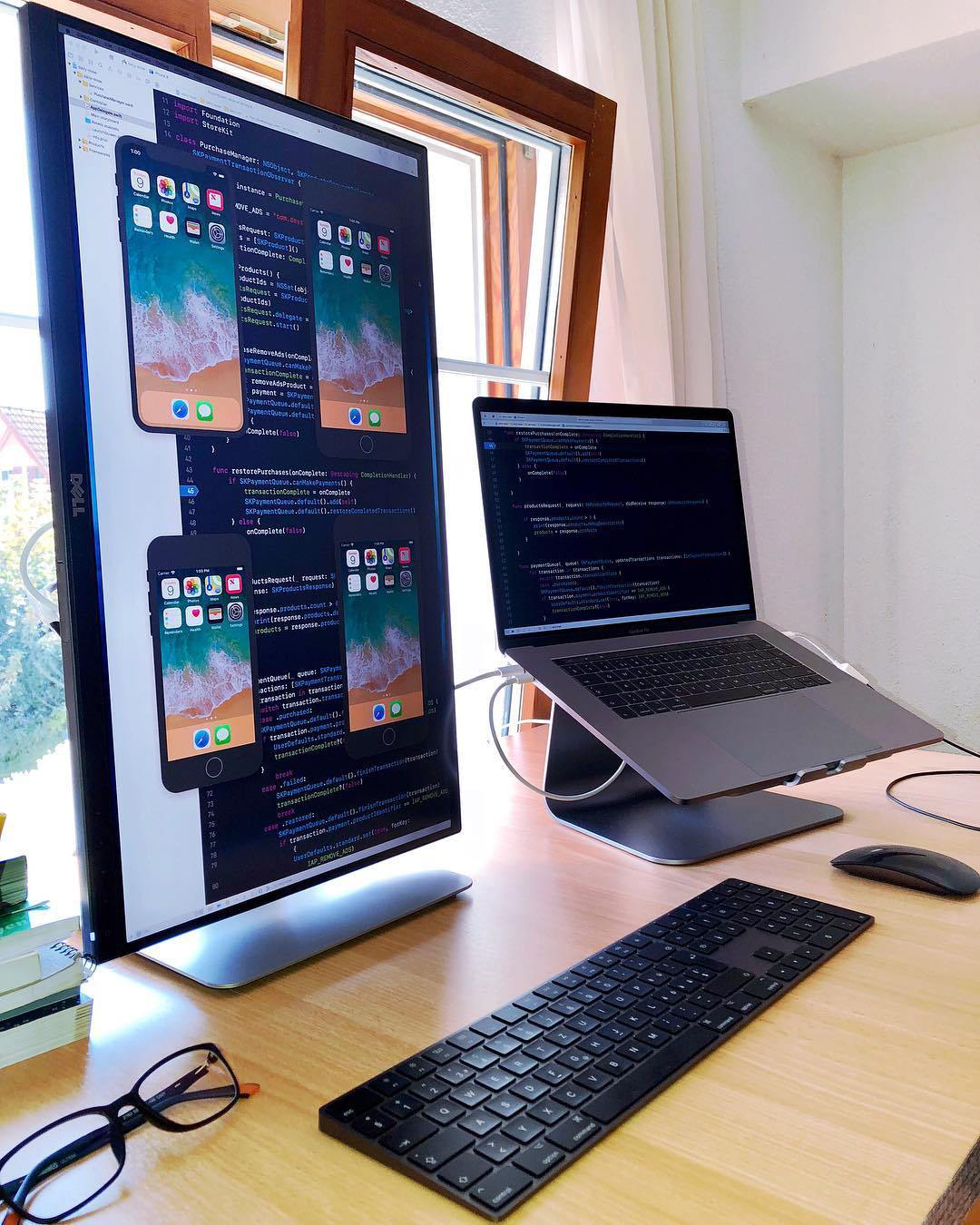
From a design standpoint, we can treat this desktop monitor like a mobile screen but on a physically larger plate of glass. Developers and gamers often use their desktop monitor this way.
Usage by Orientation
Considering that there are only two ways in which a user can hold and view a webpage on a screen, we can assume that there are only two states of design in which a webpage could be rendered.
A layout in landscape mode and a layout in portrait mode.
In reality, however, the usage of devices swings from major-landscape or landscape-only to major-portrait or portrait-only depending on the physical size of the screen.
iPad users, for example, prefer landscape over portrait about ~80% of the time, whereas mobile users are almost always (~96% usage) in portrait. The Apple Watch, which has the tiniest of viewports, is always tied and viewed to the wrist in portrait whereas television sets and projectors are nearly always mounted and viewed in landscape. Reference data and plots.
The Two Axes of Intrinsic Design.
From the usage and the knowledge of fact that there are only two possible orientations in which a webpage could be rendered, we can split the art and science of web design along the two axes of orientation. This topic is discussed at length in the next chapter A CSS Router.
This will be our first level of querying (the framework architecture) to avoid using the anti-pattern of hardcoded width-based breakpoints to switch layouts. Let's wire up the basic idea of orientation querying:
/* scss */

@import url('../toucaan/portrait/mobile.css') only screen and (orientation: portrait);

@import url('../toucaan/landscape/desktop.css') only screen and (orientation: landscape);

@media only screen and (orientation: portrait) {
  :root {
    /* Portrait stuff goes in here. */
  }
}

@media only screen and (orientation: landscape) {
  :root {
    /* Landscape stuff goes in here. */
  }
}
As you can tell, the MQ above will serve desktop css to the desktop and mobile css to mobiles in portrait mode. It solves most of what the responsive web design achieves using hardcoded width breakpoints, but our framework will still not know exactly what type of device is being served.
The advantage of Orientation Querying is that we can restrict our stylistic choices to only two possible states, and optimize our designs for each orientation independently and orthogonally.
The ruleset shown above may not seem like much at this stage but this orientation switch media query is exactly how Toucaan will deliver scaled type and intrinsic designs to the browser.
We'll discuss that in the next chapter The CSS Router.