
This article was originally featured on the The Bubblin Blog.
Welcome to the newest chapter on Rethinking CSS Frameworks with the Toucaan. In this chapter, we will implement A CSS Router that will allow us to isolate and deliver only medium-specific stylesheets that make our apps "belong" to the device.
This css router will eventually form the backbone of the Applied Principles of Intrinsic Design, therefore, we recommend the end user to read this post carefully.
Two States of Web Design
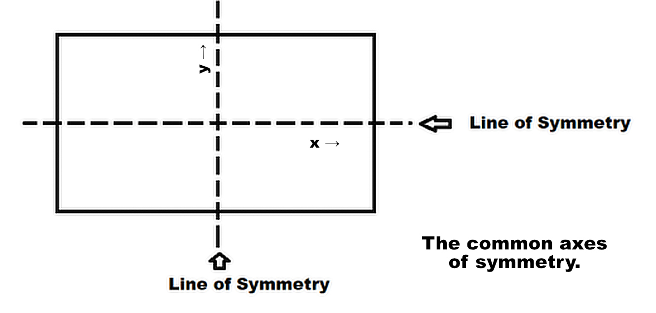
The first seemingly innocuous-looking fact about all digital mediums is that everything is a simple rectangle. All screens are rectangular. The notched, bendable, and foldable screens are also practically rectangular.
The only device I could find with a genuinely non-rectangular screen is the circular Moto 360 Watch, but it, too, under the glass, rendered all the content in shape of a rectangle, just like any other device.
The point to note here is that since the viewing area of the glowing glass is always a rectangle, the rectangle is the final state of any and every web design or render, no matter what. And since a rectangle has only two orientations: portrait and landscape, we have just the two states of web design to master for web designing.
Cool? Let us use this fact to kickstart our CSS router:
Since a rectangular viewport can be viewed in portrait (like a mobile) or landscape position (like on a desktop) only, we can start with the first level of Orientation Querying like so:
<style>
  /* Consider the following rules inside the head tag of HTML: */

  /* The x-axis of intrinsic web design */
  @media only screen and (orientation: landscape) {
    :root {
      --vmin: calc(100vh/100);
     /* All the desktop styles (except for the vertically mounted screen) go here… */
    }
  }

  /* The y-axis of intrinsic web design */
  @media only screen and (orientation: portrait) {
    :root {
      --vmin: calc(100vw/100);
      /* Mobile stylesheet over here */
    }
  }

  :root {
      --vmin: 1vmin;
      /*** Global custom properties
      like the color palette here…  ***/
  }
</style>
Looks simple enough?
From the code above, one can see that we have split our styles along the two axes of intrinsic web design, where the orientation is the first inherent quality of a rectangular screen against our visual horizon or eye-level or the field of view.
Let us turn this orientation switch to our first level of the router using an asynchronous CSS @import call like so:
<style>
    /* Replace the rules above inside the head tag of the document with the following: */

    /* The x-axis of Intrinsic Web Design */
    @import url('…/path/to/toucaan/router/landscape.css') only screen and (orientation: landscape);

    /* The y-axis of Intrinsic Web Design */
    @import url('…/path/to/toucaan/router/portrait.css') only screen and (orientation: portrait);

    :root {
        /* Global custom properties like the color palette here…  */
    }
</style>
Our router will now serve only one stylesheet into the browser environment according to the device's orientation or the shape of the browser window in case of a resizable browser like on the desktop.
Meaning if the user resizes their desktop browser to a point where the viewable window (rectangle) switches orientation from landscape to portrait, then our CSS router will prioritize portrait.css over landscape.css. Note that the router will likely continue to serve landscape.css even though it doesn't get applied because that is how the css standards expect the browsers to behave.
Perfect.
We can now scale our UI along one axis and not worry about how the website would appear on the other.
There are quite a few articles on the web that establish that a CSS @import performs poorly due to waterfall. While this analysis is true, it is often not correctly applied to how Toucaan uses it.
The performance of CSS @import degrades only when it is chain-sequenced into a waterfall of requests. If instead an @import fetches (prioritizes) only one "applicable" stylesheet from within the head of a document without further sequential chaining of multiple applicable stylesheets then there would be no meaningful waterfall.
It would be just as fast as any link statement.
In other words, if there is just one stylesheet to prioritize over and serve, using an @import statement instead of a link tag will not make a difference. Note, the browser may still fetch all the other stylesheets @imported into the document, but those will come in with a lowered priority and also not get applied to the render since they are irrelvant
Axes of Intrinsic Web Design
What our router has done so far is execute a top-level environment assessment and arrive at a suitable style resource that fits the way our eyes are physically looking at the screen. Orientation!
We can now drill down further into each axis to understand how our UI can scale and truly belong to a device to provide a more fulfilling experience to the user.
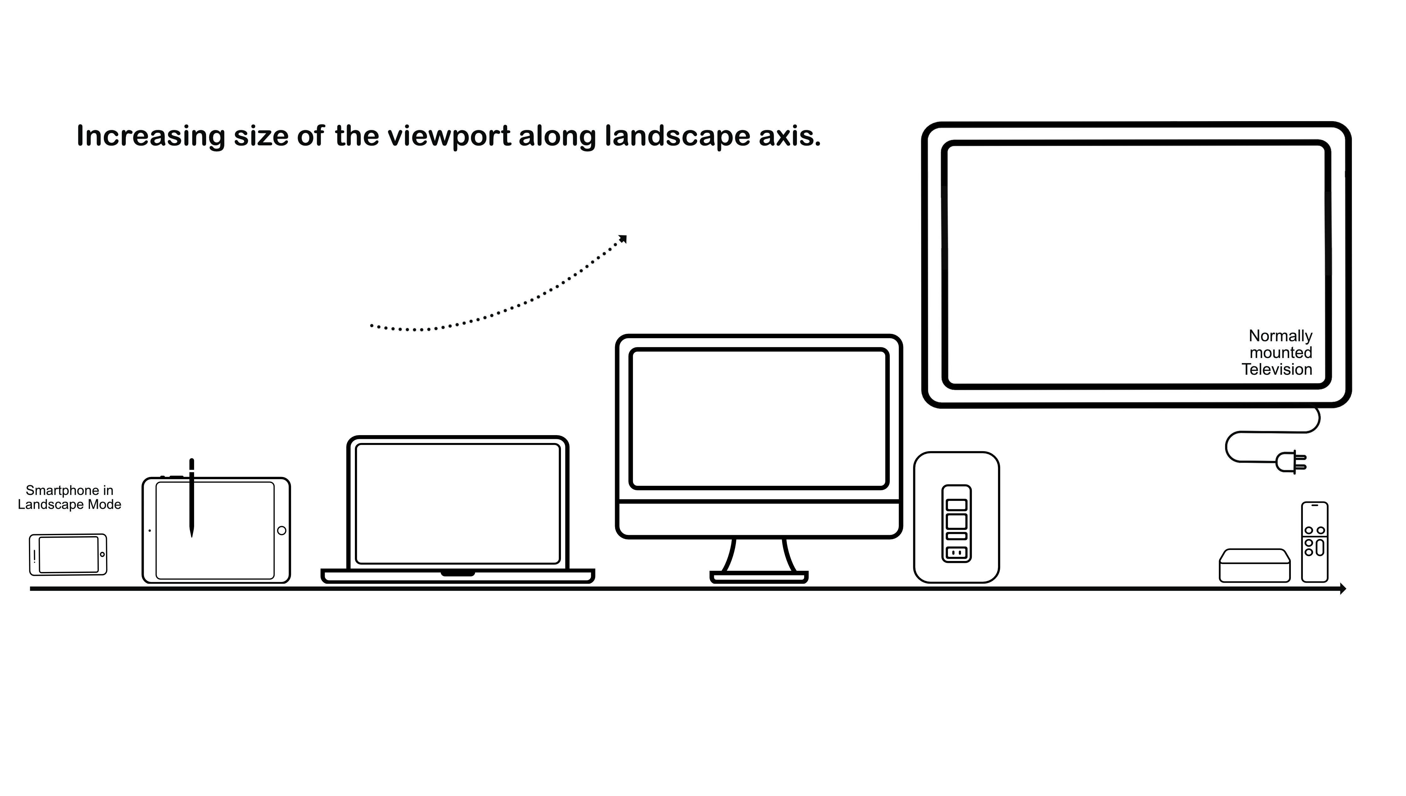
Consider the following design space:
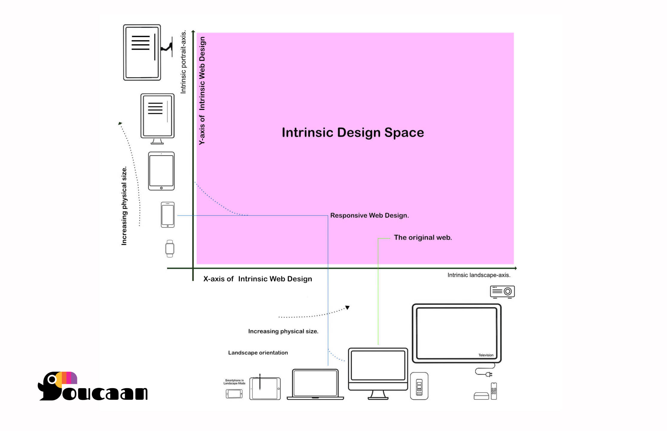
The second quality to consider for intrinsic web design is the physical size of a screen. From the plot of the design space above, one can see that the physical size of the rectangle increases a lot going up from a Watch to an LCD TV or projector (See the y-axis, for example).
We can scale our UI along the axis in the order of increasing physical size. By doing so, i.e., by scaling our UX/UI along each axis, we bake in two deeply intrinsic qualities of a device into our web design:
- Orientation, and
- Physical size.
Splitting design thinking along the two axes is akin to scaling mockups or UI according to the specifications of a device held one way or the other, without considering how the app would appear on the other.
IMO, this is almost what we do with responsive design as well, but with intrinsic web design, the separation is perhaps more explicit. It is an absolute even, to a point where the HTML served from the server could be different depending on the matched CSS route.
Increasing or decreasing the physical size of the glass (hardware) is similar to resizing a browser on a desktop but without impunity because only the manufacturers have that sort of control. The shape of glass remains a rectangle no matter what.
Scaling the UI along portrait-axis
Let us start from the y-axis of intrinsic web design. This axis contains what is known as the "mobile-first" approach of RWD.
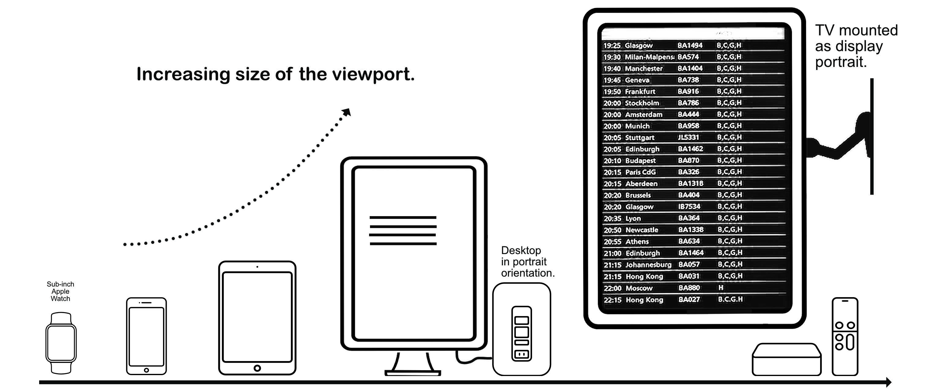
If we were to scale an app on the portrait axis of intrinsic web design, then according to the increasing physical size of the devices, our stops or "breakpoints" would go something like this:
- (A) Start with an Apple Watch (always viewed in portrait mode) to
- (B) A smartphone held in portrait grip to
- (C) A tablet held in portrait mode to
- (D) A desktop mounted in portrait mode (developers or gamers) to
- (E) A TV-set mounted on a wall in portrait mode (retail display or airport flight information display) to
- (F) A 120" wall-mounted projector screen in portrait mode.
Looks fair so far?
One can tell that we are heading towards "category-specific" breakpoints on our CSS router from the list above. Category-specific as in, from wearables → phone → tablet → … → projector in portrait orientation only.
The instance of a V9 browser displayed on a desktop-sized tablet fixed in portrait mode at the center console of a Tesla Model S is not shown on the plot above. It falls somewhere between a tablet and a desktop.
Splitting designs this way helps our router to deliver just the right amount of CSS for a given class of medium without falling into the trap of device-specific breakpoints. A design that "belongs" to the type of device at hand and its accessibility situation.
It is similar to breaking up CSS with hardcoded media queries, but the focus is on how the device category behaves and what it affords instead of the hardcoded width specification. This strategy potentially halves the amount of CSS delivered over the network––at least–– but the benefits could be more depending on routes and categories served.
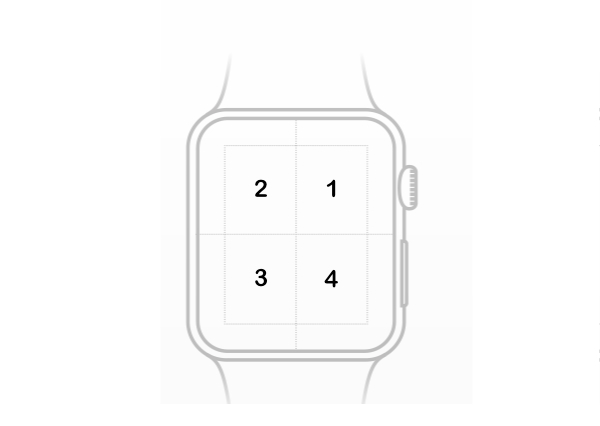
Starting from an Apple Watch.
Now, not every web app needs to or will be able to meet the challenge of fitting on an Apple Watch, but with Intrinsic Web Design, a designer has the option to start their design work from a watch.
Go watch-first.
The most remarkable quality of an Apple Watch is that it has a tiny screen—a sub-inch rectangular viewport if the bezel area around the Watch is discounted. Our fingertip can cover almost 25% of the real estate available on the Watch, so the UI components need to be scaled up for accessibility.
Designing for a medium that small can be particularly challenging.
Think of finding a UXI optimum for a super coarse pointer where every interactive action is the complete UI displayed on a Watch.
Recommended reading: Designing Web Apps for Apple Watch.
The Watch, therefore, cannot be supported with responsive web design unless generic automatic scaling (0.51 scale of responsive) is enough for your use case. The responsive approach cannot even differentiate between a mobile and a watch.
The option to contextualize and develop web design according to the environment of a wearable exists with only intrinsic web design.
Getting back to our router:
/* On the portrait-axis router. */
/* The file at --> ./toucaan/router/portrait.css */

/*** Route-in or @import wearables first. ***/
/*** 1. Apple Watch 6 for men = 44mm. Resolution: 368 x 448 pixels ***/
/*** 2. Apple Watch 6 for women = 40mm. 324 x 394 pixels   ***/
/*** 3. Moto 360 Watch = 46mm. Resolution: 360 x 330 pixels ***/

@import url('./toucaan/app/portrait/watch.css')
    only screen
    and (max-device-width: 368px)
    and (max-device-height: 448px)
    and (-webkit-device-pixel-ratio: 3);
Since a Watch is viewed in portrait mode only, we add a route for watch.css on the portrait arm of the router. All watch-specific styles can now live inside the watch.css file and are served when the router matches a wearable.
Combining the above ruleset with a level-4 media query, we get a very accurate handler for watch.css, like so:
/* On the portrait-axis router. */
/* The file at --> ./toucaan/router/portrait.css */

/*** Route-in or @import wearables first. ***/
/*** 1. Apple Watch 6 for men = 44mm. Resolution: 368 x 448 pixels ***/
/*** 2. Apple Watch 6 for women = 40mm. 324 x 394 pixels   ***/
/*** 3. Moto 360 Watch = 46mm. Resolution: 360 x 330 pixels ***/

/* Wearables */
@import url('./toucaan/portrait/watch.css')
    (max-device-width: 368px)
    and (max-device-height: 448px)
    and (-webkit-device-pixel-ratio: 3)
    and (hover: none)
    and (pointer: coarse)
    and (min-width: 200px);

/* Dropped the MQ 'only screen' because it is handled in the first level filter with orientation query on the top. */
Moving up the portrait axis, we now add a route for the next category of devices: smartphones. The following MQ range covers all the smartphones that are available on the market today (2021).
/* The portrait-axis router. */
/* The file at → ./toucaan/router/portrait.css */

1. /*** Route-in for @import watch.css ***/
…
…

2. /*** Route-in or @import mobile.css next. ***/
    /*** 1. iPhone 4 to iPhone Pro Max 12. Resolution: ***/
    /*** 2. Android phones                             ***/

/* Smartphones */
@import url('./toucaan/portrait/mobile.css')
  (min-device-width: 280px)
  and (max-device-width: 667px)
  and (-webkit-min-device-pixel-ratio: 2)
  and (hover: none)
  and (pointer: coarse),
    (min-device-width: 414px)
    and (max-device-width: 812px)
    and (-webkit-min-device-pixel-ratio: 3)
    and (hover: none)
    and (pointer: coarse),
      (device-width: 360px)
      and (device-height: 640px)
      and (-webkit-device-pixel-ratio: 4)
      and (hover: none)
      and (pointer: coarse);


/*** Route-in or @import tablet.css below, and so on… ***/
…
…
Some of the newer smartphones can unfold to become mini-tablet. Such a device may fall outside of the scope of the mobile route specified above upon unfolding. That is not a problem because our router will match the mini-tablet to the appropriate route on the landscape axis if necessary.
We will come back to this discussion in another chapter, but our router can handle foldable phones just right and deliver the correct css that belongs to the device. Intrinsic Web Design aims to support nearly all permutations and combinations of digital screens available on the web today instead of just 2-3 significant verticals like mobile, tablet, and the desktop.
Continuing on the portrait arm of our css router, let us hash out the remaining paths:
/*** Portrait or y-axis.  ***/
/* The portrait-axis router. */
/* The file at --> ./toucaan/router/portrait.css */


/*** Route-in for @import watch.css ***/
/*** a. Apple Watch 6 for men = 44mm. Resolution: 368 x 448 pixels ***/
/*** b. Apple Watch 6 for women = 40mm. 324 x 394 pixels   ***/
/*** c. Moto 360 Watch = 46mm. Resolution: 360 x 330 pixels ***/

/* Wearables */
@import url('../../dist/watch.css')
    (max-device-width: 368px)
    and (max-device-height: 448px)
    and (-webkit-device-pixel-ratio: 3)
    and (hover: none)
    and (pointer: coarse)
    and (min-width: 200px);

/*** Route-in or @import mobile.css next. ***/
/*** 1. iPhone 4 to iPhone Pro Max 12. Resolution:  ***/
/*** 2. Android phones including Galaxy Fold @280px ***/

/* Smartphones */
@import url('../../dist/mobile.css')
  (min-device-width: 280px)
  and (max-device-width: 384px)
  and (-webkit-min-device-pixel-ratio: 2)
  and (hover: none)
  and (pointer: coarse),
    (min-device-width: 414px)
    and (max-device-width: 812px)
    and (-webkit-min-device-pixel-ratio: 3)
    and (hover: none)
    and (pointer: coarse),
      (min-device-width: 360px)
      and (-webkit-device-pixel-ratio: 4)
      and (hover: none)
      and (pointer: coarse);

/*** Route-in or @import tablet.css next. ***/

/*** 1. iPad 1, 2, Mini, Air, 3, 4 and Pro 9.7, Pro 10.5, Pro 12.9 ***/
/*** 2. Android tablets: Galaxy, Nexus and Huawei ***/
/*** 3. Kindle Fire ***/

/* Tablets */
@import url('../../dist/tablet.css')
  (min-device-width: 768px)
  and (max-device-width: 1024px)
  and (-webkit-min-device-pixel-ratio: 1)
  and (hover: none)
  and (pointer: coarse),
    (min-device-width: 768px)
    and (max-device-width: 1366px)
    and (-webkit-min-device-pixel-ratio: 2)
    and (hover: none)
    and (pointer: coarse),
      (min-device-width: 601px)
      and (max-device-height: 1536px)
      and (-webkit-min-device-pixel-ratio: 1.331)
      and (-webkit-max-device-pixel-ratio: 1.332)
      and (hover: none)
      and (pointer: coarse),
        (min-device-width: 800px)
        and (max-device-width: 1600px)
        and (-webkit-min-device-pixel-ratio: 1.5)
        and (hover: none)
        and (pointer: coarse);

/*** Route-in or @import vehicle.css if required. ***/
/*** Older Tesla Model S and a few other EVs ***/

/* EVs */
/* @import url('../../dist/vehicle.css')
  (min-device-width: 1200px)
  and (max-device-width: 1920px)
  and (-webkit-min-device-pixel-ratio: 1)
  and (hover: none)
  and (pointer: coarse); */


/*** Route-in or @import desktop.css next. ***/
/*** Vertically mounted Retina & non-retina Screens ***/

/* Desktops */
@import url('../../dist/desktop.css')
  (min-device-width: 720px)
  and (max-device-height: 1920px)
  and (-webkit-min-device-pixel-ratio: 1)
  and (hover: hover)
  and (pointer: fine),
    (min-device-width: 900px)
    and (max-device-width: 2880px)
    and (-webkit-min-device-pixel-ratio: 2)
    and (min-resolution: 192dpi)
    and (hover: hover)
    and (pointer: fine);

/*** Route-in or @import television.css next. ***/

/* Limited browser support. */
/* Vertically mounted television or projector. */
@import url('../../dist/television.css')
  (min-device-width: 1440px)
  and (max-device-width: 4320px)
  and (hover: none)
  and (any-pointer: coarse);


/*
1280x720 — HD / 720p.
1920x1080 — FHD (Full HD) / 1080p.
2560x1440 — QHD/WQHD (Quad HD) / 1440p.
3840x2160 — UHD (Ultra HD) / 4K 2160p.
7680×4320 — FUHD (Full Ultra HD) / 8K 4320p.

Televisions on the lower end of the market do not sport a worthwhile web browser.
Web browsers on TVs on the high end of the market are still catching up on standards.
Warning: Poor support for CSS Grids, level 4 media queries, and several other CSS features.

WebOS from LG is pointer-driven.
*/
The router rules above match the industry-wide categories as on date instead of the device-inspired breakpoints in use with Responsive Web Design. Furthermore, the level-4 media queries also add another intrinsic quality of the device at hand on the delivered css.
It contextualizes properties like touch-action: auto and pointer: coarse strictly for a given device and splits the global scope of the overall app according to the client environments.
Advantages of using a router
Since the accessibility situation of mobile is entirely different from the accessibility situation of a, say, Tesla Model S car (where the driver or the pilot is constrained by a safety belt and is required to focus on the changing road conditions), it makes sense to separate the stylistic choices made for the user for each medium via a separate stylesheet. Note that this is true even though both smartphones and Tesla cars are touch devices.
Similarly, routing CSS according to intrinsic capabilities along the axes of IWD has several other advantages:
-
It allows web designers to work on logically closer modules together. If the intended UX/UI on the tablet is close to the implemented mobile UI, then all the designer has to do is copy
mobile.cssintotablet.cssand start there. The IWD router also helps avoid the giant leap one has to take to switch between a touch-sensitive context (mobile) and a pointer-driven context (desktop), both of which, as seen from the plot above, live on entirely different axes of web design. -
It helps with a macro-optimization of delivering only relevant CSS for a given device. Users on a mobile, for example, do not need to download and parse six thousand lines of desktop css and override it.
-
It separates the CSS modules according to industry-wide categories and not according to the device specifications. If Apple were to release a new iPhone of a different resolution or pixel density tomorrow, our router would be able to serve the new phone with the same
mobile.cssbecause it falls under the mobile category. -
The design thinking accounts for the orientation, physical size, accessibility constraints, and screen-specific capabilities (touch or pointer-driven) in a way that web design can "belong to" a device. Going intrinsic is perhaps the best way to design and develop native mobile apps using the building blocks of the web-aka, HTML, CSS, JavaScript, and WebAssembly.
-
It affords better maintainability with proper scoping of stylesheets according to the { app: device } combinations. It helps the developer organize CSS like a monorepo and keep the designs separate according to medium.
Disadvantage
It might appear like much CSS to maintain, but if we were to look at a real production-scale app, with all of the reset.css framework.css and app.css, plus the many workarounds over the limitations of RWD, the intrinsic approach is a far more maintainable choice. More often than not, a router would likely split CSS near the past hardcoded MQ breakpoints of RWD.
Intrinsic vs. Responsive Design
Responsive web design can be considered a subset of intrinsic web design, in that responsive is limited to thinking design of mobile and desktop UI mostly, but it also does not recognize the fact that mobile UI is portrait UI on the y-axis of a rectangle whereas the desktop UI is landscape UI on the x-axis of a rectangle.
Intrinsic can also differ significantly from responsive depending on how deep an implementation builds UX/UIs that utilize the intrinsic capabilities and thus "belong." On the plot of design space of intrinsic web design (diagram shown above), RWD focuses on mobile and desktop, and the point of intersection is where the design meets its media-query breakpoint.
Looking closely, RWD tries to implement a similar separation of design states, but it fails to establish a boundary. It does not push the designer to think UI independent of the other device. This, in my opinion, is a significant drawback of responsive web design and prevents it from scaling according to the new landscape of the web.
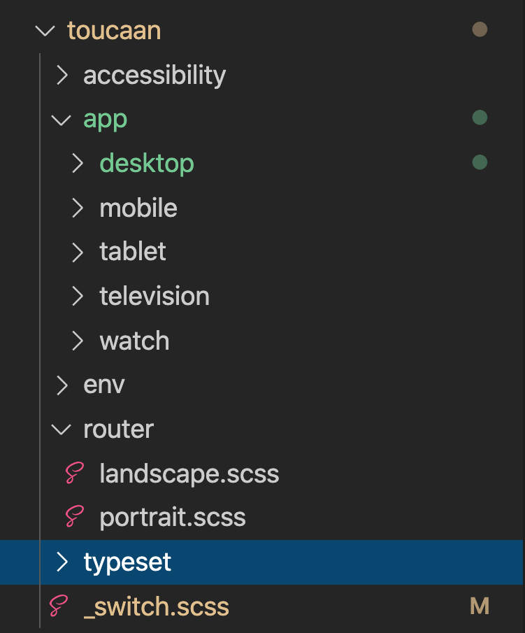
The complete router
With our router's portrait-arm, we scale our landscape UI along the x-axis of Intrinsic Web Design according to increasing physical size. Since a wearable like the Apple Watch does not support landscape orientation (yet), we start on our router like so:
- (A) Start with a smartphone held in landscape orientation to
- (B) A tablet held in landscape mode to
- (C) A desktop in landscape (natural) setting to
- (D) A TV-set mounted on a wall in landscape
- (E) A 120" wall-mounted projector screen in landscape.
The instance of a V9 browser displayed on a desktop-sized tablet dashboard fixed in landscape mode at the center console of a Tesla Model 3 is not shown above.
Ultra-widescreen monitors can also be thrown into the mix and targeted with an eccentric layout that fits the medium intrinsically. After adding all the routes on the landscape arm, our application CSS will look something like this:
Our router will replace the traditional link to the stylesheet in the head of a document:
<head>
  …
  …
  <style>
     /* Orientation switching for screens or _switch.scss */
      @import url('…/path/to/toucaan/router/landscape.css') only screen and (orientation: landscape);
      @import url('…/path/to/toucaan/router/portrait.css') only screen and (orientation: portrait);

    :root {
        /* Global custom properties like the color palette here…  */
    }
</style>

</head>
The complete code with coverage for both x and y-axis routes is available on GitHub. Note that a route (for example, mobile on the portrait-axis and tablet on the portrait-axis) can link to the same stylesheet mobile.css file as long as it scales correctly. It has been left up to the author to determine how they wish to design their apps and split the CSS accordingly to meet intrinsic support for their apps.
That is it. Our CSS router is ready.
We can now replace the old and rather lifeless link tag in the document's head with some critical router CSS and quickly transform our app into an intrinsically designed one.
Feel free to peruse the source code of the above router on the Toucaan submodule repository. PRs are welcome.
Share thoughts in the comments below.
Credits: With thanks to AJ Alkasmi and Sonica Arora for helping me edit this article.